TensorFlow 모델 분석 시각화
컬렉션을 사용해 정리하기
내 환경설정을 기준으로 콘텐츠를 저장하고 분류하세요.
평가 실행의 출력은 tfma.view.render_slicing_metrics
(또는 플롯의 경우 tfma.view.render_plot
)를 호출하여 Jupyter 노트북에서 시각화할 수 있는 tfma.EvalResult
입니다.
측정항목 보기
측정항목을 보려면 평가 실행의 출력인 tfma.EvalResult
전달하는 tfma.view.render_slicing_metrics
API를 사용하세요. 측정항목 보기는 세 부분으로 구성됩니다.
측정항목 선택기
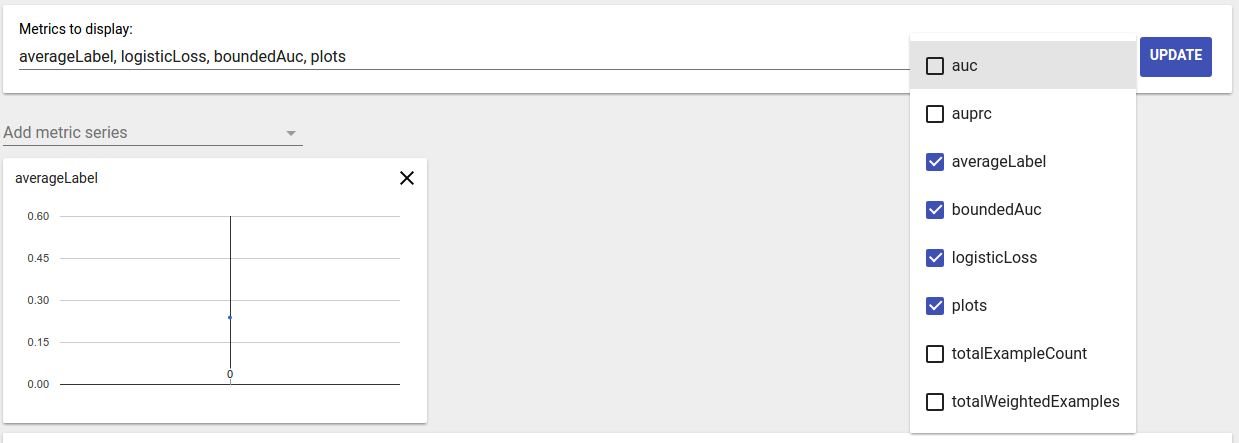
기본적으로 계산된 모든 지표가 표시되고 열은 사전순으로 정렬됩니다. 측정항목 선택기를 사용하면 사용자가 측정항목을 추가/제거/재주문할 수 있습니다. 드롭다운에서 측정항목을 선택/선택 취소하거나(다중 선택하려면 Ctrl 키를 누르세요) 입력 상자에 직접 입력/재정렬하세요.

측정항목 시각화
측정항목 시각화는 선택한 기능의 조각에 대한 직관을 제공하는 것을 목표로 합니다. 빠른 필터링을 사용하면 가중치가 적용된 샘플 수가 적은 슬라이스를 필터링할 수 있습니다.

두 가지 유형의 시각화가 지원됩니다.
슬라이스 개요
이 보기에서는 선택한 메트릭의 값이 각 조각에 대해 렌더링되며 조각은 조각 이름이나 다른 메트릭 값을 기준으로 정렬될 수 있습니다.

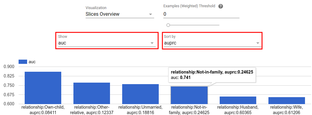
조각 수가 적은 경우 이것이 기본 보기입니다.
측정항목 히스토그램
이 보기에서는 조각이 측정항목 값을 기준으로 버킷으로 분류됩니다. 각 버킷에 표시되는 값은 버킷의 슬라이스 수이거나 버킷의 모든 슬라이스에 대한 총 가중치 샘플 수이거나 둘 다일 수 있습니다.

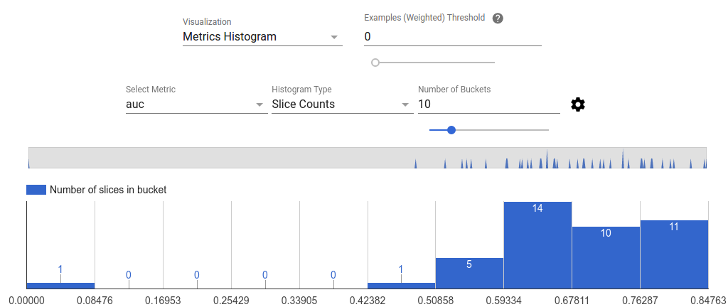
설정 메뉴에서 기어 아이콘을 클릭하면 버킷 수를 변경할 수 있고 로그 눈금을 적용할 수 있습니다.

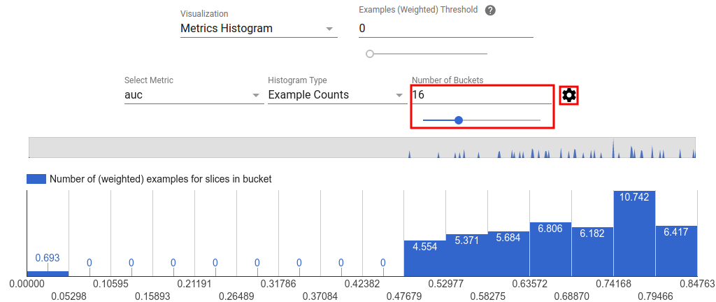
히스토그램 보기에서 이상값을 필터링하는 것도 가능합니다. 아래 스크린샷과 같이 히스토그램에서 원하는 범위를 드래그하면 됩니다.

조각 수가 많으면 이것이 기본 보기입니다.
측정항목 테이블
측정항목 표에는 측정항목 선택기에서 선택한 모든 측정항목에 대한 결과가 요약되어 있습니다. 측정항목 이름을 클릭하면 정렬할 수 있습니다. 필터링되지 않은 조각만 렌더링됩니다.
플롯 뷰
각 플롯에는 플롯에 고유한 시각화가 있습니다. 자세한 내용은 플롯 클래스에 대한 관련 API 문서를 참조하세요. TFMA에서 플롯과 메트릭은 모두 tfma.metrics.*
관례적으로 플롯과 관련된 클래스는 Plot
으로 끝납니다. 플롯을 보려면 평가 실행에서 출력된 tfma.EvalResult
전달하는 tfma.view.render_plot
API를 사용하세요.
시계열 그래프
시계열 그래프를 사용하면 데이터 범위 또는 모델 실행에 대한 특정 지표의 추세를 쉽게 파악할 수 있습니다. 시계열 그래프를 생성하려면 여러 평가를 수행한 다음(출력을 다른 디렉터리에 저장) tfma.load_eval_results
를 호출하여 tfma.EvalResults
객체에 로드합니다. 그런 다음 tfma.view.render_time_series
사용하여 결과를 표시할 수 있습니다.
특정 지표에 대한 그래프를 표시하려면 드롭다운 목록에서 해당 지표를 클릭하기만 하면 됩니다. 그래프를 닫으려면 오른쪽 상단에 있는 X를 클릭하세요.

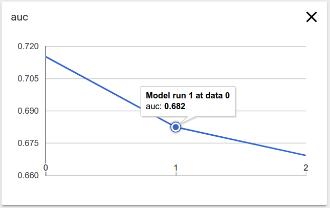
그래프의 데이터 포인트 위로 마우스를 가져가면 모델 실행, 데이터 범위 및 측정항목 값을 나타내는 도구 설명이 표시됩니다.
달리 명시되지 않는 한 이 페이지의 콘텐츠에는 Creative Commons Attribution 4.0 라이선스에 따라 라이선스가 부여되며, 코드 샘플에는 Apache 2.0 라이선스에 따라 라이선스가 부여됩니다. 자세한 내용은 Google Developers 사이트 정책을 참조하세요. 자바는 Oracle 및/또는 Oracle 계열사의 등록 상표입니다.
최종 업데이트: 2025-07-25(UTC)
[null,null,["최종 업데이트: 2025-07-25(UTC)"],[],[],null,["# TensorFlow Model Analysis Visualizations\n\n\u003cbr /\u003e\n\nThe output of running an evaluation is a\n[`tfma.EvalResult`](https://www.tensorflow.org/tfx/model_analysis/api_docs/python/tfma/EvalResult)\nwhich can be visualized in a Jupyter notebook by calling\n[`tfma.view.render_slicing_metrics`](https://www.tensorflow.org/tfx/model_analysis/api_docs/python/tfma/view/render_slicing_metrics)\n(or\n[`tfma.view.render_plot`](https://www.tensorflow.org/tfx/model_analysis/api_docs/python/tfma/view/render_plot)\nfor plots).\n\n### Metrics View\n\nTo view metrics, use the\n[`tfma.view.render_slicing_metrics`](https://www.tensorflow.org/tfx/model_analysis/api_docs/python/tfma/view/render_slicing_metrics)\nAPI passing the [`tfma.EvalResult`](https://www.tensorflow.org/tfx/model_analysis/api_docs/python/tfma/EvalResult) that was output from the evaluation run. The\nmetrics view is composed of three parts:\n\n- Metrics Selector\n\n By default, all computed metrics are displayed and the columns are sorted\n alphabetically. Metrics selector allows the user to add / remove / reorder\n metrics. Simply check / uncheck metrics from the dropdown (hold Ctrl for\n multi-select) or type / re-arrange them directly in the input box.\n\n- Metric Visualization\n\n Metric visualization aims to provide intuition about slices in the feature\n chosen. A quick filtering is available to filter out slices with small\n weighted sample count.\n\n Two type of visualizations are supported:\n 1. Slice overview\n\n In this view, value for the chosen metric is rendered for each slice and\n the slices can be sorted by the slice name or the value of another\n metric.\n\n When the number of slices are small, this is the default view.\n 2. Metrics Histogram\n\n In this view, slices are broken down into buckets based on their metric\n values. The value(s) displayed in each bucket can be the number of\n slices in the bucket or the total weighted sample count for all slices\n in the bucket or both.\n\n The number of buckets can be changed and logarithmic scale can be\n applied in the settings menu by clicking on the gear icon.\n\n It is also possible to filter out outliers in the histogram view. Simply\n drag the desired range in the histogram as shown in the screenshot\n below.\n\n When the number of slices are large, this is the default view.\n- Metrics Table\n\n The metric table summarizes results for all metrics chosen in metrics\n selector. It can be sorted by clicking on the metric name. Only slices not\n filtered out will be rendered.\n\n### Plot Views\n\nEach plot has it own visualization that is unique to the plot. For more\ninformation, see the relevant API documentation for the plot class. Note that\nin TFMA, plots and metrics are both defined under [`tfma.metrics.*`](https://www.tensorflow.org/tfx/model_analysis/api_docs/python/tfma/api/metrics)\nBy convention the classes related to plots end in `Plot`. To view plots, use the\n[`tfma.view.render_plot`](https://www.tensorflow.org/tfx/model_analysis/api_docs/python/tfma/view/render_plot)\nAPI passing the [`tfma.EvalResult`](https://www.tensorflow.org/tfx/model_analysis/api_docs/python/tfma/EvalResult) that was output from the evaluation run.\n\n### Time Series Graphs\n\nTime series graphs make it easy to spot trends of a specific metric over data\nspans or model runs. To create a time series graph, perform multiple evaluations\n(saving the output to different directories), and then load them into a\n`tfma.EvalResults` object by calling\n[`tfma.load_eval_results`](https://www.tensorflow.org/tfx/model_analysis/api_docs/python/tfma/api/load_eval_results).\nThe results can then be displayed using\n[`tfma.view.render_time_series`](https://www.tensorflow.org/tfx/model_analysis/api_docs/python/tfma/view/render_time_series)\n\nTo display the graph for a specific metric, simply click on it from the dropdown\nlist. To dismiss a graph, click on the X on the upper right corner.\n\nHover over any data point in the graph shows a tooltip indicating model run,\ndata span, and metric value."]]