
The output of running an evaluation is a
tfma.EvalResult
which can be visualized in a Jupyter notebook by calling
tfma.view.render_slicing_metrics
(or
tfma.view.render_plot
for plots).
Metrics View
To view metrics, use the
tfma.view.render_slicing_metrics
API passing the tfma.EvalResult that was output from the evaluation run. The
metrics view is composed of three parts:
Metrics Selector
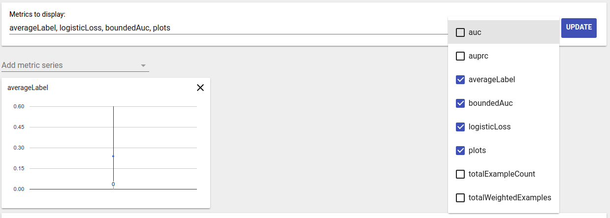
By default, all computed metrics are displayed and the columns are sorted alphabetically. Metrics selector allows the user to add / remove / reorder metrics. Simply check / uncheck metrics from the dropdown (hold Ctrl for multi-select) or type / re-arrange them directly in the input box.
Metric Visualization
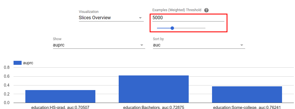
Metric visualization aims to provide intuition about slices in the feature chosen. A quick filtering is available to filter out slices with small weighted sample count.
Two type of visualizations are supported:
Slice overview
In this view, value for the chosen metric is rendered for each slice and the slices can be sorted by the slice name or the value of another metric.
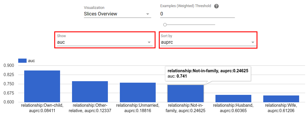
When the number of slices are small, this is the default view.
Metrics Histogram
In this view, slices are broken down into buckets based on their metric values. The value(s) displayed in each bucket can be the number of slices in the bucket or the total weighted sample count for all slices in the bucket or both.
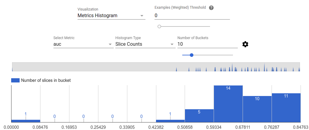
The number of buckets can be changed and logarithmic scale can be applied in the settings menu by clicking on the gear icon.
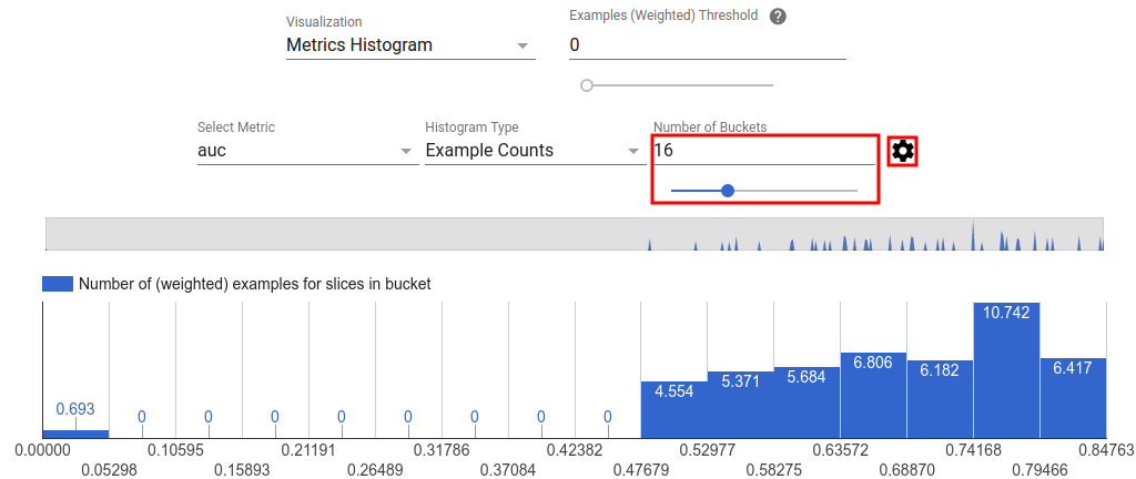
It is also possible to filter out outliers in the histogram view. Simply drag the desired range in the histogram as shown in the screenshot below.
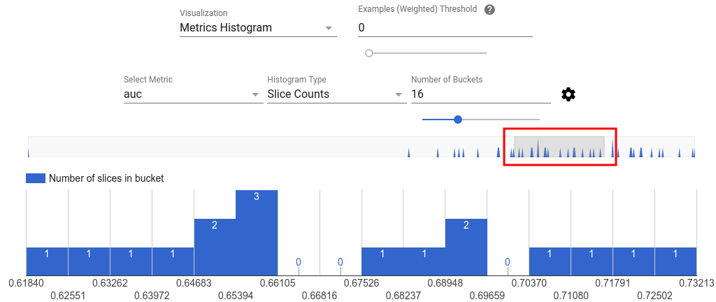
When the number of slices are large, this is the default view.
Metrics Table
The metric table summarizes results for all metrics chosen in metrics selector. It can be sorted by clicking on the metric name. Only slices not filtered out will be rendered.
Plot Views
Each plot has it own visualization that is unique to the plot. For more
information, see the relevant API documentation for the plot class. Note that
in TFMA, plots and metrics are both defined under tfma.metrics.*
By convention the classes related to plots end in Plot. To view plots, use the
tfma.view.render_plot
API passing the tfma.EvalResult that was output from the evaluation run.
Time Series Graphs
Time series graphs make it easy to spot trends of a specific metric over data
spans or model runs. To create a time series graph, perform multiple evaluations
(saving the output to different directories), and then load them into a
tfma.EvalResults object by calling
tfma.load_eval_results.
The results can then be displayed using
tfma.view.render_time_series
To display the graph for a specific metric, simply click on it from the dropdown list. To dismiss a graph, click on the X on the upper right corner.
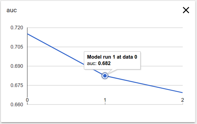
Hover over any data point in the graph shows a tooltip indicating model run, data span, and metric value.